Explaining Machine Learning Models: A Non-Technical Guide to Interpreting SHAP Analyses
With interpretability becoming an increasingly important requirement for machine learning projects, there's a growing need to communicate the complex outputs of model interpretation techniques to non-technical stakeholders. SHAP (SHapley Additive exPlanations) is arguably the most powerful method for explaining how machine learning models make predictions, but the results from SHAP analyses can be non-intuitive to those unfamiliar with the approach.
This guide is intended to serve two audiences:
- For data scientists, this guide outlines a structured approach for presenting the results from a SHAP analysis, and how to explain the recommended plots to an audience unfamiliar with SHAP.
- For people who need to be able to understand SHAP outputs but not the underlying method, this guide provides thorough explanations for how to interpret commonly produced SHAP plots and derive meaningful insights from them.
This guide prioritises clarity over strict technical accuracy. For those who wish to dig deeper on certain topics, links to useful resources are provided. Code for reproducing this analysis can be found on GitHub.
What is SHAP?
SHAP is a method that explains how individual predictions are made by a machine learning model. SHAP deconstructs a prediction into a sum of contributions from each of the model's input variables.[1, 2] For each instance in the data (i.e. row), the contribution from each input variable (aka "feature") towards the model's prediction will vary depending on the values of the variables for that particular instance.
To understand how these contributions combine to explain a prediction, it is necessary to discuss what the output of a machine learning model looks like.
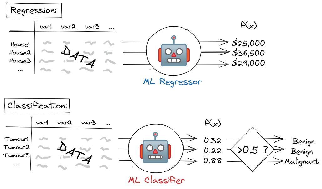
In the case of a machine learning regressor model - i.e. a model that predicts a continuous outcome - the output is simply the predicted value: e.g. the price of a house, or tomorrow's temperature.
For a machine learning classifier model - i.e. a model that predicts a binary yes/no outcome - the situation is slightly more complex. In this case, the model outputs a score between 0 and 1, which is then thresholded at a specified value (typically 0.5). Scores above the threshold correspond to a positive prediction (e.g. the tumour is malignant) whereas scores below this threshold correspond to a negative prediction (the tumour is benign). This score can loosely (but not strictly, unless the model has been calibrated[3]) be treated as a probability, where higher scores correspond to more confident positive predictions, and lower scores correspond to more confident negative predictions.
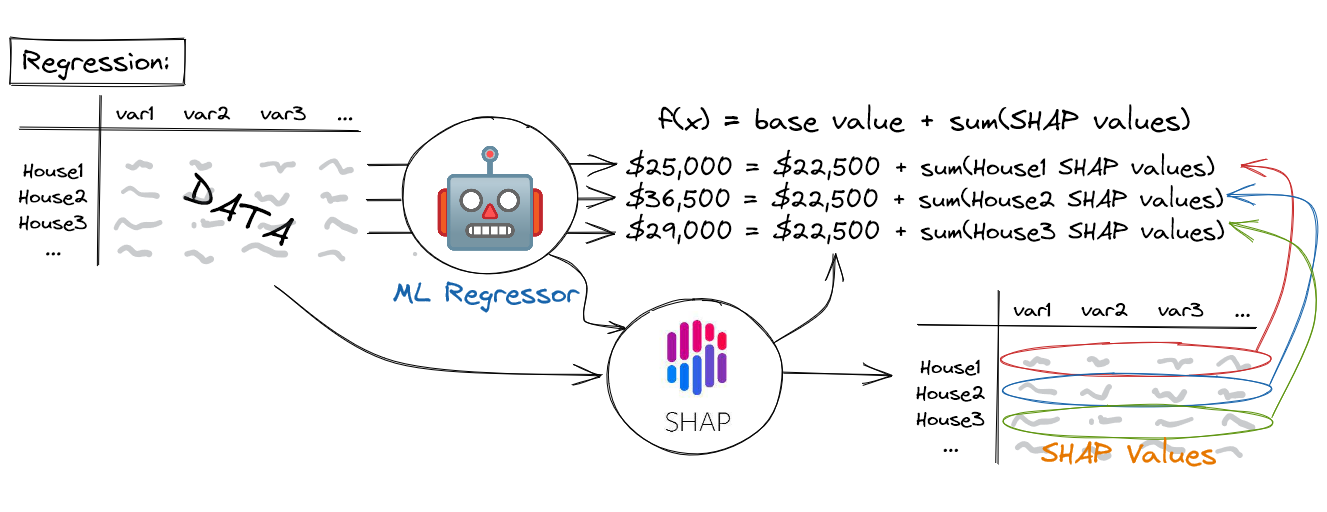
A machine learning model's prediction, f(x), can be represented as the sum of its computed SHAP values, plus a fixed base value, such that: $$ f(x) = base\;value + sum(SHAP\;values) $$
The output of SHAP is a dataset with the same dimensions as that on which the model was originally trained (i.e. it has the same input variables as columns and the same instances as rows). Instead of containing the values of the underlying data, however, this dataset contains SHAP values. Crucially, the machine learning model's predictions for each instance can be reproduced as the sum of these SHAP values, plus a fixed base value, such that the model output, \( f(x) = base\;value + sum(SHAP\;values) \). For regression models, the base value is equal to the mean of the target variable (e.g. the mean house price in the dataset), whereas for classification models, the base value is equal to the prevalence of the positive class (e.g. the percentage of tumours in the dataset that are malignant). As we shall see in the sections below, SHAP values reveal interesting insights into how the input variables are impacting the predictions of the machine learning model, both at the level of individual instances and across the population as a whole.
SHAP can be applied to any machine learning model as a post hoc interpretation technique - i.e. it is applied after model training, and is agnostic towards the algorithm itself. That said, it is particularly efficient to compute SHAP for tree-based models, such as random forests and gradient boosted trees.[4]
What can SHAP be used for?
SHAP quantifies how important each input variable is to a model for making predictions. This can be a useful sanity check that the model is behaving in a reasonable way: does the model leverage the features we expect it to based on domain expertise? This is also a way of satisfying "right to explanation" requirements in regulatory settings.[5]
Occasionally, SHAP will surface an unusually strong relationship between an innocuous feature and the predicted outcome. This is usually due to an issue in the underlying data, such as an information leak from the target variable being predicted to the feature in question. As such, SHAP can be a useful diagnostic tool when models have suspiciously high predictive performance.
Other times, these surprising relationships are legitimate and can serve as a mechanism for hypothesis generation: i.e. why is this feature so predictive and what can we do to validate this theory?
Caution should be exercised when deriving insights from SHAP analyses. It is important not to become over-invested in conclusions that certain features cause certain outcomes unless the experiment has been conducted within a causal framework (this is rarely the case).[6] SHAP only tells you what the model is doing within the context of the data on which it has been trained: it doesn't necessarily reveal the true relationship between variables and outcomes in the real world. Decision-makers are often tempted to view features in SHAP analyses as dials that can be manipulated to engineer specific outcomes, so this distinction must be communicated.
SHAP Analysis Walk-Through
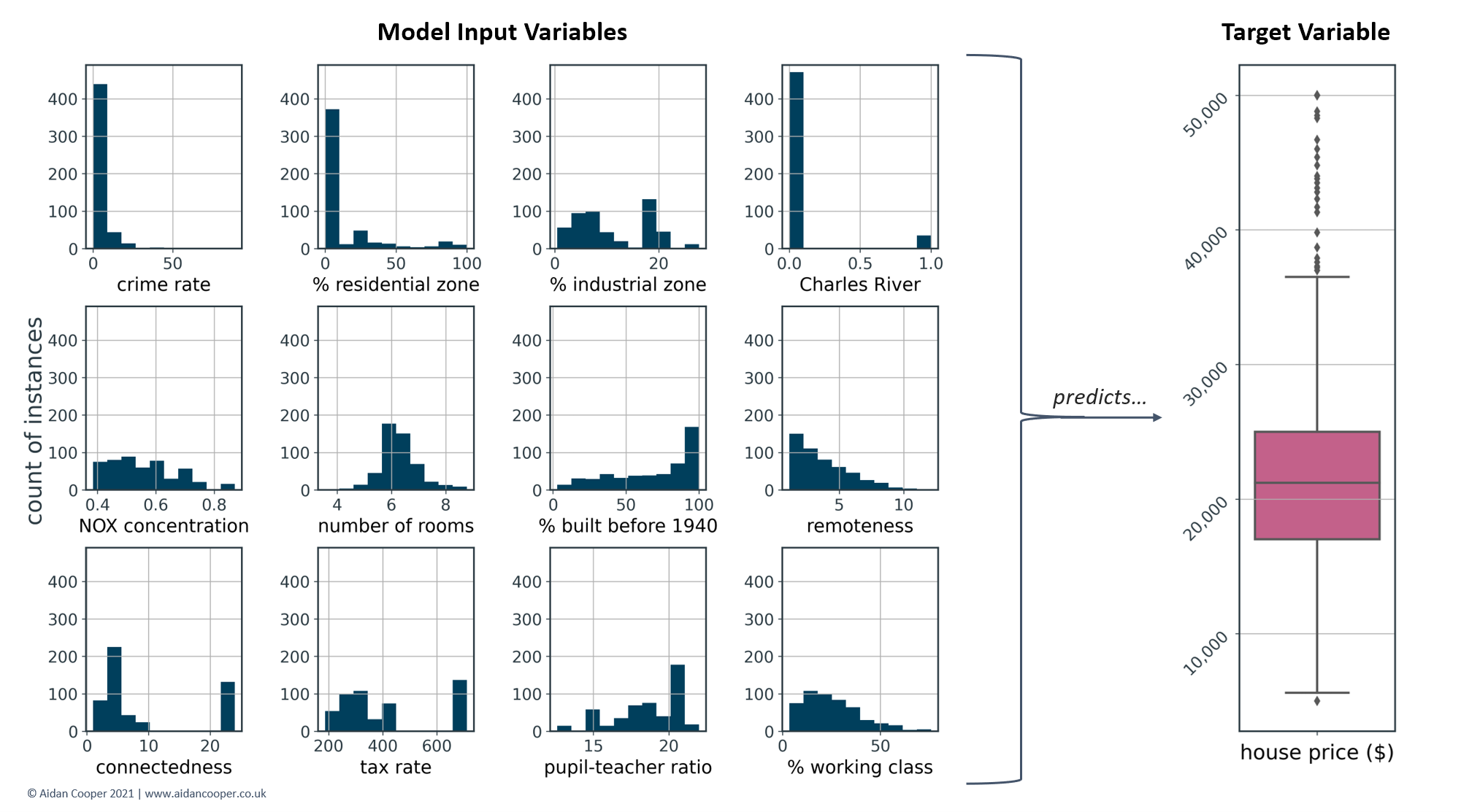
For this example walk-through of a SHAP analysis, we are using a modified version of a popular dataset describing 506 instances of house prices in Boston.[7] This is a regression problem where the task is to develop a machine learning model that predicts a continuous house price based on 12 features, which are outlined in Table 1.
| Variable Name | Description |
|---|---|
| crime rate | Per capita crime rate in the town. |
| % residential zone | Percentage of land zoned for residential use. |
| % industrial zone | Percentage of land zoned for industrial use. |
| Charles River | 1 if the house borders the Charles River; 0 otherwise. |
| NOX concentration | Nitric oxides concentration (parts per 10 million). |
| number of rooms | The average number of rooms per house in the housing unit. |
| % built before 1940 | The proportion of houses built prior to 1940 in the unit. |
| remoteness | A measure of how far the housing is from employment centres (higher is more remote). |
| connectedness | A measure of how good the local road connections are (higher is more connected). |
| tax rate | Property tax rate per $10,000 of house value. |
| pupil-teacher ratio | The pupil:teacher ratio of the town. |
| % working class | Percentage of the population that is working class. |
Table 1. The model input variables used to predict house prices. This is a modified version of the Boston Housing Price dataset.7 Variable names and descriptions have been simplified.
Figure 3 shows the distributions of the features in Table 1, as well as the target values of the house prices that the machine learning regressor model is predicting. The median house price is $21,200 - this data is from the '70s, after all...!
SHAP is a model-agnostic technique that can be applied to any machine learning algorithm, so the specifics of the model development process are unimportant to this discussion. For this walk-through, a gradient boosted tree model was trained, which is a powerful and popular algorithm for these sorts of tasks.
Local interpretability: explaining individual predictions
Explaining predictions for individual instances of the data is referred to as local interpretability. SHAP explains how individual predictions are arrived at in terms of contributions from each of the model's input variables. This is a highly intuitive approach that produces simple but informative outputs.
Waterfall plots
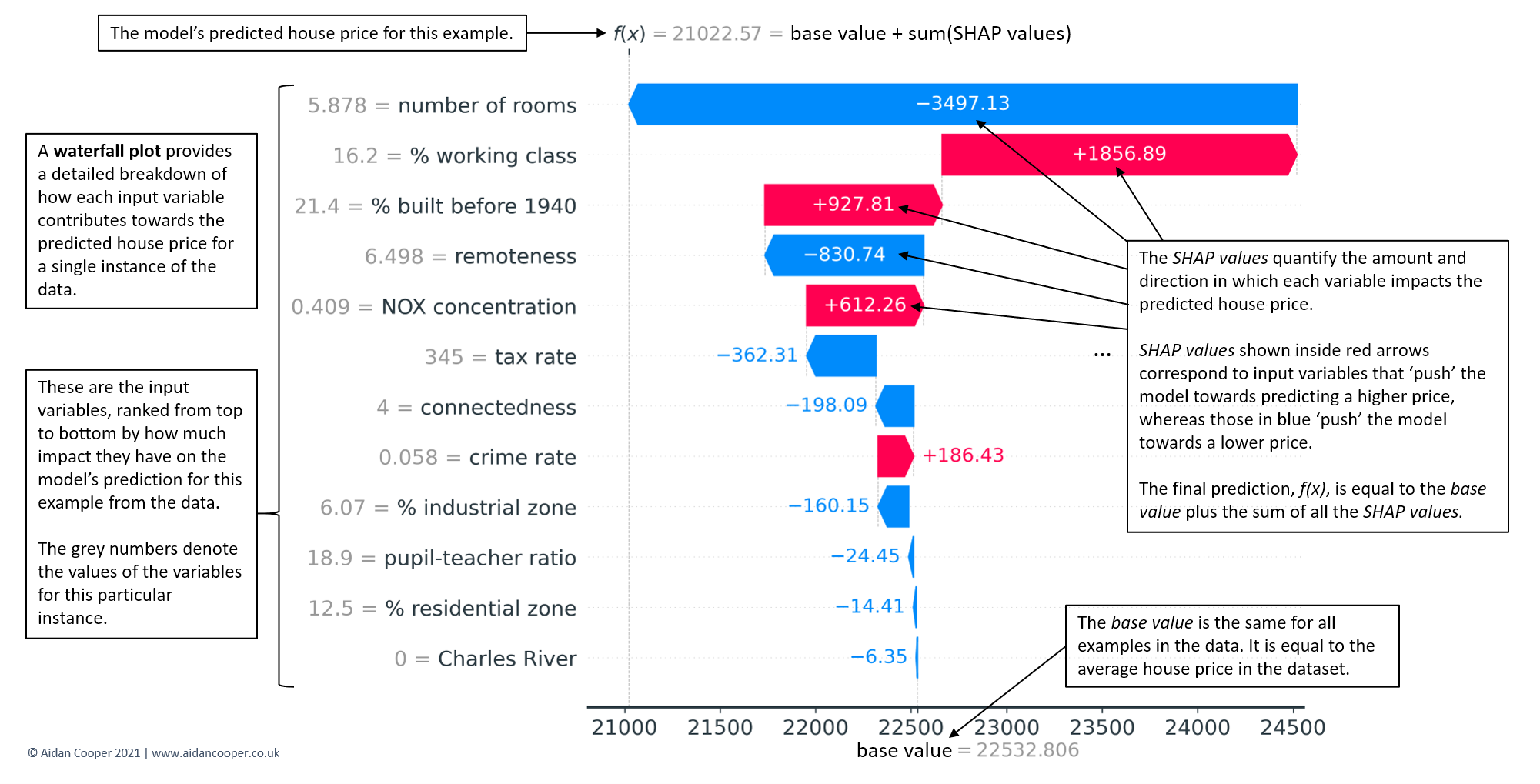
Waterfall plots the most complete display of a single prediction. In Figure 4, an example waterfall plot explains the underlying contributions of each feature to the prediction for the median-priced house in the dataset. The waterfall structure emphasises the additive nature of positive and negative contributors, and how they build on the base value to yield the model's prediction, f(x).
Force plots
Whereas waterfall plots are expansive and spare no detail when explaining a prediction, force plots are equivalent representations that display the key information in a more condensed format (Figure 5).
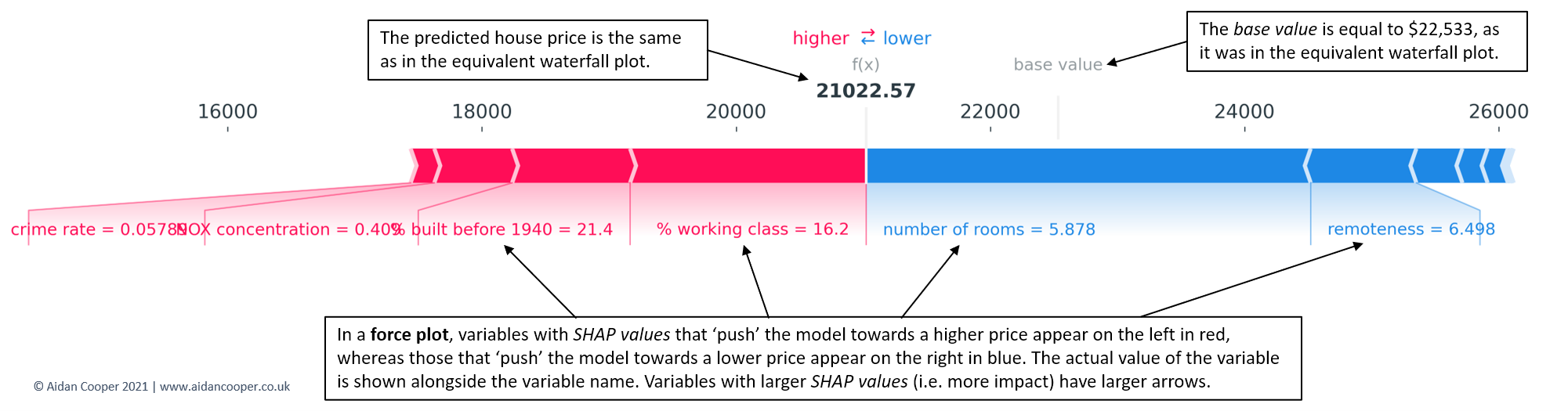
Force plots are useful for examining explanations for multiple instances of the data at once, as their compact construction allows for outputs to be stacked vertically for ease of comparison (Figure 6).
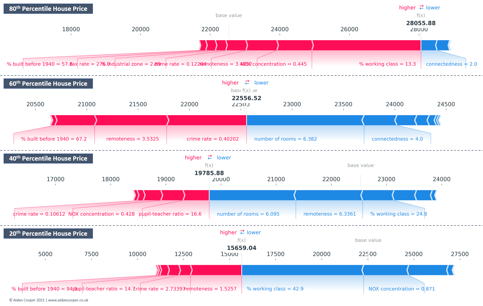
Global interpretability: understanding drivers of predictions across the population
The goal of global interpretation methods is to describe the expected behaviour of a machine learning model with respect to the whole distribution of values for its input variables. With SHAP, this is achieved by aggregating the SHAP values for individual instances across the entire population.
Bar plots
The simplest starting point for global interpretation with SHAP is to examine the mean absolute SHAP value for each feature across all of the data. This quantifies, on average, the magnitude (positive or negative) of each feature's contribution towards the predicted house prices. Features with higher mean absolute SHAP values are more influential. Mean absolute SHAP values are essentially a drop-in replacement for more traditional feature importance measures but have two key advantages:
- Mean absolute SHAP values are more theoretically rigorous, and relate to which features impact predictions most (which is usually what we're interested in). Conventional feature importances are measured in more abstract and algorithm-specific ways, and are determined by how much each feature improves the model's predictive performance.
- Mean absolute SHAP values have intuitive units - for this example, they are quantified in dollars, like the target variable. Feature importances are often expressed in counterintuitive units based on complex concepts such as tree algorithm node impurities.
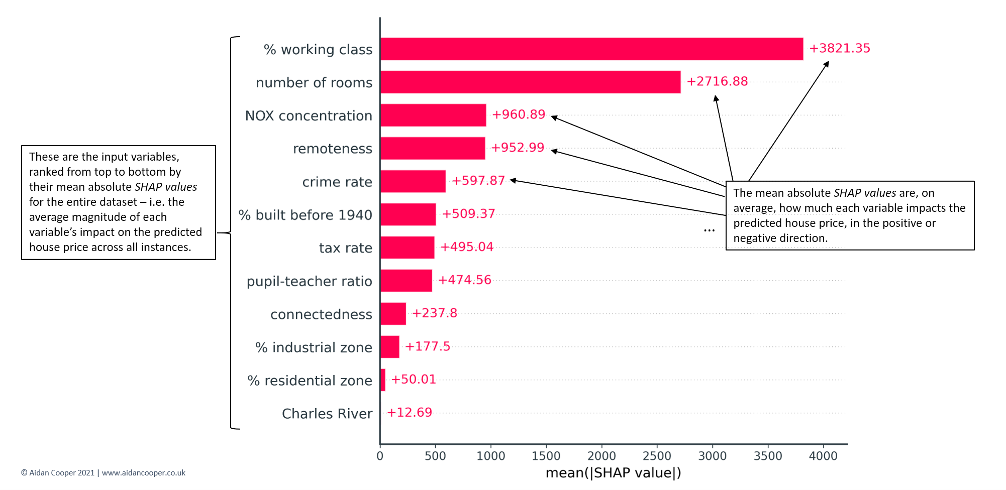
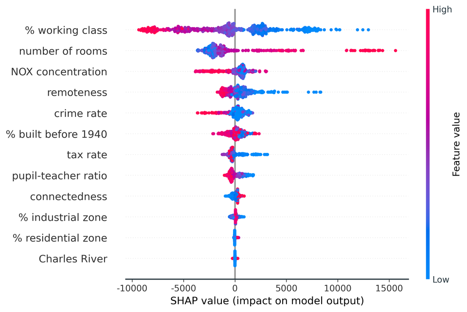
Mean absolute SHAP values are typically displayed as bar plots that rank features by their importance, as shown in Figure 7. The key characteristics to examine are the ordering of features and the relative magnitudes of the mean absolute SHAP values. Here we see that % working class is the most influential variable, contributing on average ±$3,821 to each predicted house price. By contrast, the least informative variable, Charles River, contributes only ±$13 - not surprising considering it has the same value of 0 for 93% of the dataset (see Figure 3).
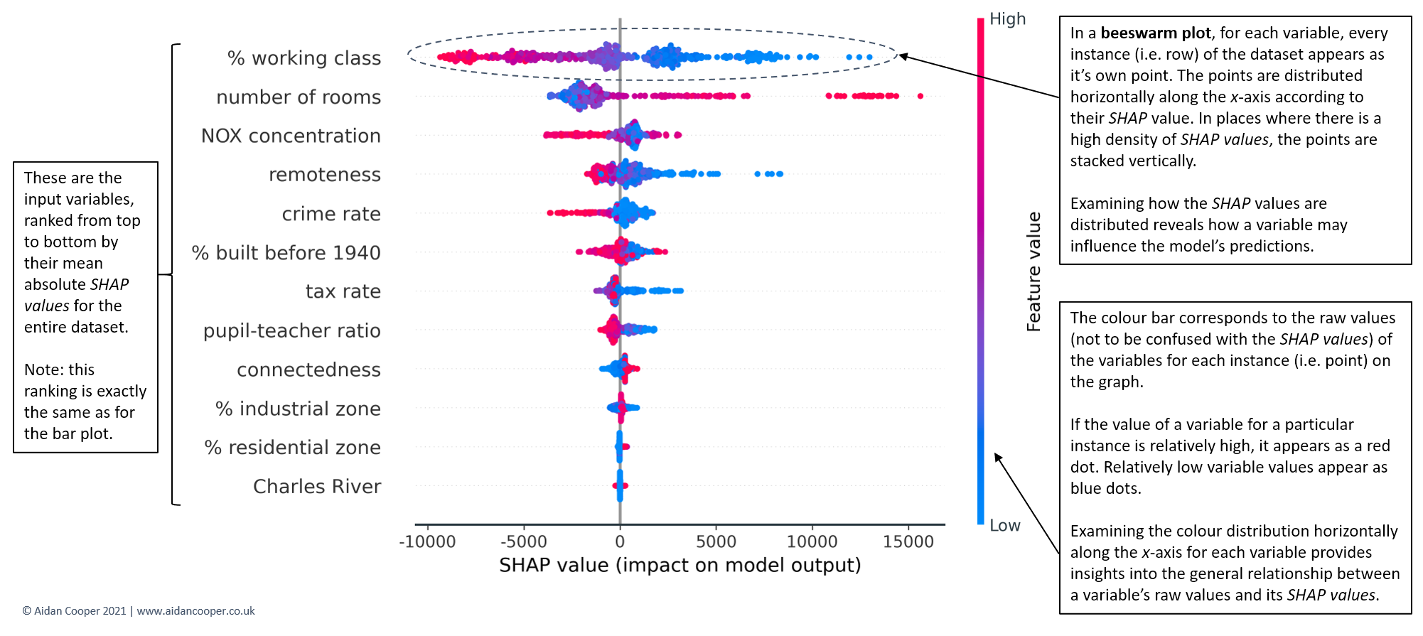
Beeswarm plots
SHAP feature importance bar plots are a superior approach to traditional alternatives but in isolation, they provide little additional value beyond their more rigorous theoretical underpinnings. Beeswarm plots are a more complex and information-rich display of SHAP values that reveal not just the relative importance of features, but their actual relationships with the predicted outcome.
Figure 9 shows the beeswarm plot for our Boston house prices example. Whereas before the bar plot told us nothing about how the underlying values of each feature relate to the model's predictions, now we can examine these relationships.
For instance, we see that lower values of % working class have positive SHAP values (the points extending towards the right are increasingly blue) and higher values of % working class have negative SHAP values (the points extending towards the left are increasingly red). This indicates that houses in more working-class areas have lower predicted prices. The reverse is seen for number of rooms - higher room counts lead to higher house price predictions.
The distribution of points can also be informative. For crime rate, we see a dense cluster of low crime rate instances (blue points) with small but positive SHAP values. Instances of higher crime (red points) extend further towards the left, suggesting high crime has a stronger negative impact on price than the positive impact of low crime on price.
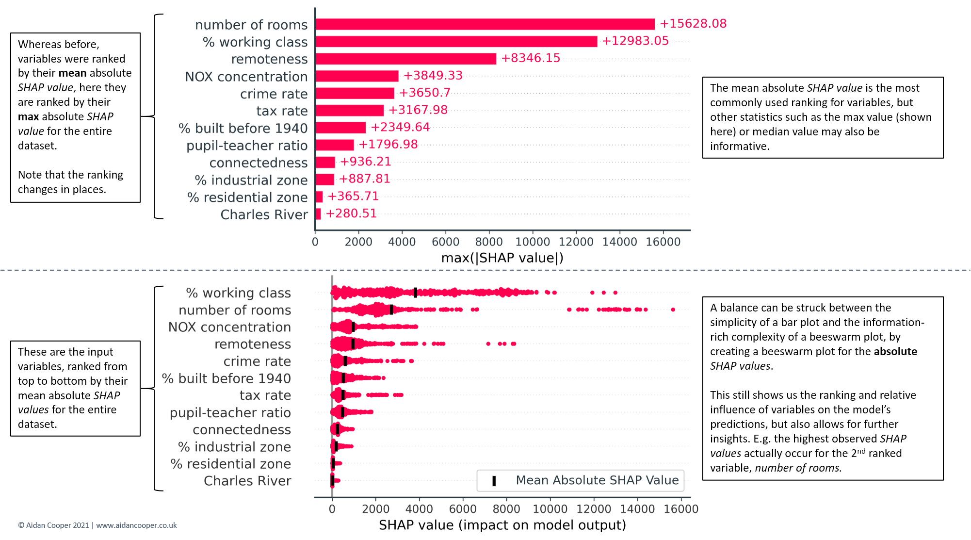
Although the bar and beeswarm plots in Figures 7 and 8 are by far the most commonly-used global representations of SHAP values, other visualisations can also be created. Figure 9 highlights two variations: one that employs maximum rather than mean absolute SHAP values; and one that is a hybrid of the bar and beeswarm plots.
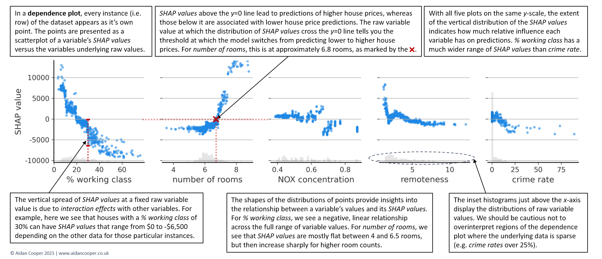
Dependence plots
Beeswarm plots are information-dense and provide a broad overview of SHAP values for many features at once. However, to truly understand the relationship between a feature's values and the model's predicted outcomes, its necessary to examine dependence plots.
Figure 10 shows dependence plots for the top five features, and reveals that the relationship between SHAP values and variable values are quite different for each of them. % working class exhibits a negative, approximately linear trend throughout its range of values. The SHAP values for number of rooms are comparable between 4 and 6.5 rooms, but then increase sharply. For NOX concentration, the distribution is disjointed, with a notable separation for variable values on either side of 0.68 parts per 10 million.
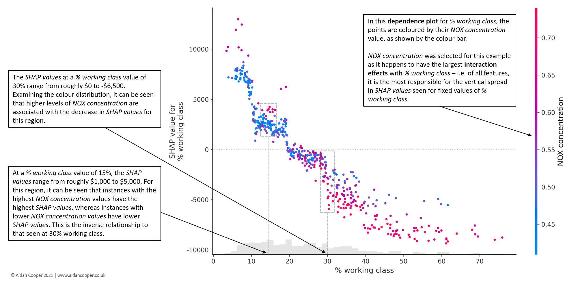
The vertical dispersion in SHAP values seen for fixed variable values is due to interaction effects with other features. This means that an instance's SHAP value for a feature is not solely dependent on the value of that feature, but is also influenced by the values of the instance's other features. Dependence plots are often coloured by the values of a strongly interacting feature, as exemplified in Figure 11. For this house pricing dataset, the interaction effects aren't especially prominent, but some case studies have dramatic interactions between features.[8]
Conclusion
SHAP is a powerful machine learning interpretation technique capable of producing a plethora of complex analytical outputs. Careful consideration should be employed when constructing a story that communicates SHAP results to stakeholders to ensure that the conclusions are valid and the limitations of the technique are understood. I hope the recommendations and explanations in this guide provide an actionable framework that helps your SHAP analyses have their desired impact.
 AidanCooper
Code for this analysis can be found on GitHub
1. Lundberg and Lee, A Unified Approach to Interpreting Model Predictions
2. Molnar, Interpretable Machine Learning - SHAP
3. Calster et al, Calibration: the Achilles heel of predictive analytics
4. Lundberg et al, From local explanations to global understanding with explainable AI for trees
5. Wikipedia, Right to explanation
6. Lundberg, Be Careful When Interpreting Predictive Models in Search of Causal Insights
7. The Boston Housing Dataset
8. SHAP Documentation: NHANES I Survival Model
Member discussion